15
Dec
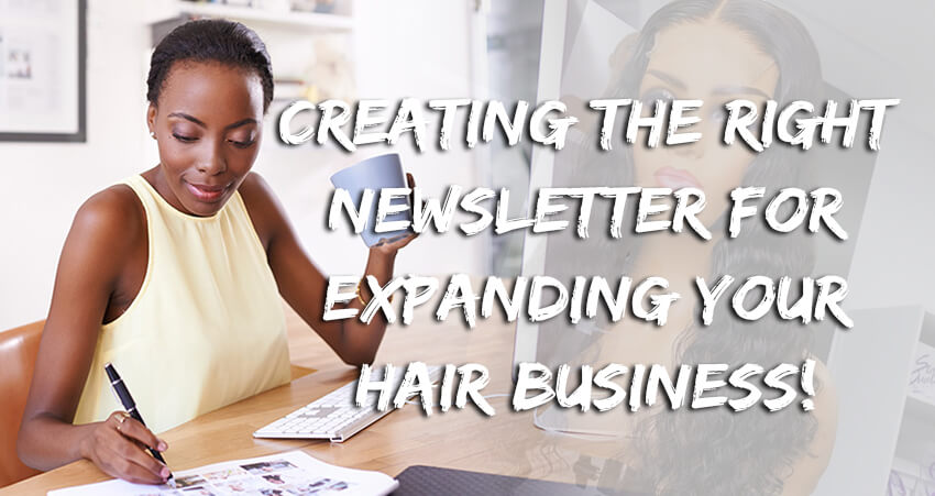
Creating The Right Newsletter For Expanding Your Hair Business!
Posted By: Marcella Whyte
Maybe someone told you that there was no effect for hair business via email promotion nowadays. Now more and more companies are beginning to heavily market through social media channels, but why according to marketing Sherpa 72% of people prefer to receive promotional information via email while just 17% prefer social media. Anyway, email promotion is not dead.
Through email there's such a huge opportunity for outreach, think about it not everybody has a Facebook, Twitter or Instagram, but I doubt you can think of one person who doesn't have an email, well, at least not one person who's not correctly thinking about what homework they have tonight, so there's a huge opportunity in email marketing, but it has to be done properly. Let the others continue to turn to social media while you take the next steps to marketing via email.
So by now you've definitely heard you're supposed to be growing and building your email list right but if you can't tell me that without a shadow of a doubt your emails are pulling their weight doing their job and helping you build up a sustainable marketing practice in your creative small hair business.
The right way not only is it what the majority prefers but it's now less competitive than ever, so if you're looking for some ideas look no further over the next few minutes. I'll take you through some simple design tips that will boost your sales and customer interaction all through your company's email marketing strategy.
Let's get started for the first time.
1. Deign For The Mobile Devices
Ever more people own smartphones than a laptop or a desktop computer, and on that same token people are spending an absurd amount of time on their mobile devices considering a mobile first approach is a great place to start. When redesigning your email newsletters, you can find several mobile optimized templates on business website, and with these you’ll see single column designs and bigger fonts to ensure people can view your message even on the smallest of screens. There’s also an innovative way to take advantage of the single column designs which I’ll get to shortly.
2. Use a Clean And Organized Layout
You don't want to overcrowd your page with unnecessary distractions, keep it clean and simple only using what you feel, you really need if you are heaving trouble. Put your thoughts on paper first, a first draft sketch will help you discover what elements matter the most reducing overall clutter, viewers will be pleased to find a more orderly design leading them directly to what they wanted to see in the first place.
3. Keep Text Short And Sweet
Now we all receive those emails, and newsletters with text. On top of text personally with my short attention span, I might read one line before unsubscribing. People want to be able to scan a newsletter and find information relevant to them quickly, stay away from sending the same information over and over again, and ensure whatever information you are pushing is consistently relevant.
4. Create Visual Hierarchy
You want to create a sense of importance with elements like colors sizes and shapes, you want to direct you readers attention through the use of these visuals. The most effective designs will utilize visual hierarchy properly typically leading their readers into a call to action another point that we'll discuss here shortly if you want to get an idea of what's important in your image. Use the squint test in other words, partially blur your image here.
5. Embrace White Space
In my second tip I mentioned only utilizing elements in your design that are completely necessary. Well, if you only have one or two important elements that's ok leaving a healthy amount of white space allows the viewer to easily absorb the elements in a design.
6. Frame Content With Headers/Footers
The header of an image is the first opportunity for you to grab a reader's attention and make a first impression, those 2-3 inches can either peak someone's curiosity or possibly entice them to move om. So how can you utilize that space, lush added a relaxing yet attention-grabbing slogan and then brilliantly. Added their social media icons and the viewer is interested, they'll remember those icons and click to see more. You can also add those icons in your footer as well as lusted here. But most newsletters will use that footer to add the unsubscribe button, as you have to in compliance with the can-spam act.
7. Set the Mood With Color
When choosing a color scheme for your newsletter, don't just pick a color because it's your favorite. Colors are much more that research shows, how each color can elicit feelings and emotions and viewers. Blue is a color of trust peace, loyalty orange is associated with creativity, fun black is signifies luxury. Do your own research and choose colors that complement and reinforce your brand's identity.
8. Simplify Font Choices
Now we’ve all fallen victim to scrolling through the hundreds of font choices available for too long. There's courier and impact in papyrus and chalkboard. You will ever need some are humanists based on old calligraphic scripts, others are geometric which are more modern fonts. A font on paper isn't the same as it's on screen, some fonts don't display well through pixels. Take note of this guide and keep it handy for all your future newsletters.
9. Use Stunning Images
As I'm sure you've heard a picture can be worth a thousand words, so if this is the case why not replace text with a well-thought-out picture? An image can get a message across and make a big statement, but be careful that your image isn't too large, a picture should never take up more than 30% of a newsletter or else. Background also very important for a product image.
10. Embed Videos/GIF Image
Videos and GIF images can show more of your products, so viewers can get more information from the newsletter. Videos and GIF absorb more eyes.
11. Inform with Infographics
An infographic in your newsletter can help a viewer digest your information easier and quicker than before.
12. Create a Compelling Call To Action
Make sure you create a compelling call to action in your newsletter email marketing can reinforce brand awareness, but there’s a much bigger opportunity to engage your readers add that link, taking your reader to your shop or even to a new page.
For starting a hair business, pictures and videos still the best way to show the styles of hair bundles or human hair wigs, and add a link on the pictures, then the viewers can see more description of your hair. That's why we must use newsletters. JC Hair Factory is one of the leading hair extensions suppliers in China for more than 18 years. We offer best wholesale hair extensions to worldwide markets. If you have any questions or inquires, please feel free to contact us directly. Welcome to visit our factory!


